



Table of Contents
Accessible Color Combinations: A Practical Guide to WCAG-Compliant Design
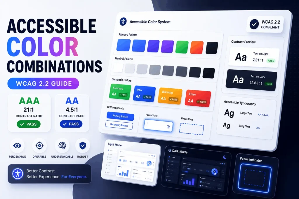
An accessible color combination is any foreground-and-background pairing that meets a contrast ratio of at least 4.5:1 for normal text and 3:1 for large text or UI components, per WCAG 2.2 Level AA. Black on white (21:1) is the extreme case; most working palettes land somewhere between 4.5:1 and 12:1. Designing with accessible color combinations doesn’t mean ruining your brand palette. Below, you’ll find the exact ratios for dozens of real color pairs, the WCAG rules behind them, and how to build a palette that stays true to your brand without failing an audit.
Color contrast isn’t a design nicety — it’s the difference between a site that a person with low vision, color blindness, or a cracked phone screen in direct sunlight can actually read, and one they abandon. Roughly 2.2 billion people worldwide live with some form of vision impairment, according to the World Health Organization, and low contrast text is consistently the single most common failure type in WebAIM’s annual accessibility audit of the top million websites — found on the large majority of home pages tested, year after year.
One pattern shows up in nearly every audit we see: teams treat contrast as a design-polish step handled at the very end, after components are built and brand colors are locked. By then, fixing a failing pair means reopening a dozen components instead of adjusting one token in a design system. The cheapest time to catch a contrast problem is before a color ever ships into a component library — not after QA flags it, and not after a legal complaint does.
Who This Guide Is For
Whether you’re a UI designer, front-end developer, product manager, accessibility specialist, or website owner, this guide walks through the practical decisions involved in choosing accessible color combinations. Instead of focusing only on WCAG theory, it explains how contrast works in real interfaces, where teams most often fail audits, and how to fix those issues without abandoning an established brand palette.

What Makes a Color Combination “Accessible”?
An accessible color combination does two things at once: it provides enough contrast between foreground and background elements to be legible, and it avoids relying on color alone to communicate meaning. Contrast is the measurable part — a mathematical ratio between two colors’ relative luminance. Meaning is the judgment part — making sure a color-blind user isn’t missing information that only color conveys, like a red asterisk marking a required field with no accompanying label.
Both matter, and this is where a lot of otherwise careful teams still get tripped up. A palette can pass every automated contrast check and still fail a manual accessibility review, because automated tools only test the math — they can’t tell you that your “success” and “warning” badges are indistinguishable to a color-blind user, or that your focus indicator disappears against your new dark-mode background. Contrast checkers are necessary but not sufficient.
Accessibility Audit Note: This gap — automated pass, manual fail — is exactly why the “color as the only cue” criterion (WCAG 1.4.1) sits under Level A rather than being folded into the AA contrast math. No formula can evaluate meaning, only luminance. It has to be checked by a person looking at the interface and asking what happens if color is removed.
WCAG Contrast Ratio Requirements, by Level
WCAG defines three conformance levels, and each one sets a different bar for color contrast.
| Level | Normal text | Large text (18pt+/14pt bold+) | UI components & graphics |
|---|---|---|---|
| A | No numeric minimum — color can’t be the only cue | Same | Same |
| AA | 4.5:1 | 3:1 | 3:1 |
| AAA | 7:1 | 4.5:1 | Not defined |

Level AA is the standard referenced by the ADA, Section 508, and the European Accessibility Act, and it’s the target most teams should design for. AAA is worth pursuing for body copy on content-heavy pages — articles, legal text, anything meant to be read start to finish — but it’s rarely practical for an entire interface, especially once you factor in brand colors and CTA buttons that need to stand out visually.
A quick way to think about it: AA is “everyone can read this without straining.” AAA is “even someone with significant low vision, reading in poor lighting, can read this comfortably.”
Note on the 3:1 UI component rule: This part of AA is the one teams miss most often, because it’s newer (introduced in WCAG 2.1) and less well-known than the 4.5:1 text rule. It applies to input borders, icon-only buttons, focus indicators, and chart elements — not just text. An audit that only checks paragraph and heading contrast and skips form borders and icons is an incomplete audit. This one rule alone accounts for a large share of the “surprise” failures teams encounter when a formal audit runs after they believed the site was already compliant.
WCAG Versions Explained
If you’re wondering whether to follow WCAG 2.0, 2.1, or 2.2, the answer is simple: use WCAG 2.2 whenever possible. The color contrast requirements themselves did not change between these versions, but newer versions introduced additional accessibility success criteria that affect modern interfaces. A design that passes WCAG 2.2 automatically satisfies the earlier color contrast requirements while aligning with current accessibility guidance.
Looking Ahead: WCAG 3.0 and APCA
Accessibility guidance continues to evolve. While WCAG 2.2 remains the current and most widely adopted standard for websites and applications, future versions of WCAG are expected to place greater emphasis on how people actually perceive contrast rather than relying solely on mathematical luminance ratios.
One of the most notable developments is the Advanced Perceptual Contrast Algorithm (APCA), which is being explored as part of WCAG 3.0. Unlike the current contrast ratio model, APCA considers additional factors that influence readability in real-world interfaces, including font size, font weight, and how text appears against different backgrounds. In practice, this means two color combinations with similar numeric values may not always provide the same reading experience for users.
For designers and developers, APCA is worth keeping an eye on because it reflects the industry’s broader shift toward more human-centered accessibility measurements. However, it is important to understand that APCA has not replaced WCAG 2.2’s contrast requirements. Today, WCAG 2.2 Level AA remains the most practical, widely recognized, and legally referenced accessibility target for digital products.
The best approach is simple: design for WCAG 2.2 today while building flexible design systems that can easily adapt as accessibility standards continue to evolve.
How Contrast Ratio Is Actually Calculated
You don’t need to do this math by hand, but understanding it helps explain why some intuitive pairings fail. WCAG contrast is based on relative luminance — a weighted measure of how much light a color reflects, calculated from its red, green, and blue channels (green contributes the most to perceived brightness, blue the least). The ratio compares the luminance of the lighter color to the darker one, producing a number between 1:1 (identical) and 21:1 (pure black on pure white).
This is also why hue alone tells you nothing about accessibility. Two colors can look worlds apart and still fail — a saturated red and a saturated green often sit close together in luminance even though they’re opposite on the color wheel, which is exactly why red/green pairings are a recurring accessibility trap. It’s also why “it looks readable to me” is not a valid test: perceived readability and measured contrast frequently disagree, especially for anyone testing on a bright, well-calibrated monitor rather than an average phone screen in daylight.
Pro Tip: Run any pairing you’re unsure about through a color contrast checker before it reaches production. It takes seconds, and it removes the single biggest source of disagreement in design reviews — two people arguing over whether something “looks” readable enough.
Why Designers Still Misjudge Contrast
Human eyes naturally judge color before brightness. Two colors can appear dramatically different because of hue while reflecting almost the same amount of light. Since WCAG evaluates luminance rather than hue, many combinations that feel readable fail mathematically.
Ambient lighting, monitor calibration, screen brightness, OLED displays, and visual adaptation also influence perceived readability. That’s why accessibility decisions should always rely on measured contrast ratios instead of visual judgment alone.
Accessible Color Combinations That Actually Pass AA
Here are real hex-coded pairs with their calculated contrast ratios, organized by use case. These are starting points — always verify the exact shades you use, since a tiny hex adjustment can push a color above or below the threshold.

| Foreground | Background | Ratio | Passes |
|---|---|---|---|
| #000000 (black) | #FFFFFF (white) | 21:1 | AAA |
| #333333 (dark gray) | #FFFFFF | 12.6:1 | AAA |
| #003366 (navy) | #FFFFFF | 12.6:1 | AAA |
| #FFFFFF | #2E5AAC (royal blue) | 6.6:1 | AA |
| #FFFFFF | #1E6B3C (forest green) | 6.5:1 | AA |
| #FFFFFF | #C1272D (crimson) | 5.8:1 | AA |
| #000000 | #FFB000 (amber) | 11.5:1 | AAA |
| #767676 (mid gray) | #FFFFFF | 4.5:1 | AA (just passes) |
| #FFFFFF | #0F7A76 (teal) | 5.2:1 | AA |
| #1D4ED8 (link blue) | #FFFFFF | 6.7:1 | AA |
| #6D28D9 (visited purple) | #FFFFFF | 7.1:1 | AAA |
Accessible Color Pair Selection Process
When selecting a new foreground and background combination, follow this order:
- Start with your intended brand colors.
- Measure the contrast ratio.
- Decide whether the text qualifies as normal or large.
- Adjust only the lightness or darkness if needed.
- Verify hover, focus, disabled, and dark-mode versions separately.
- Save the approved pair as a reusable design token.
Notice the mid-gray entry: #767676 on white lands at exactly 4.5:1, the minimum. This is the line most designers cross without realizing it — anything lighter, like the popular #999999 or #AAAAAA, drops well below AA (2.32:1 for #AAAAAA) and fails outright, even though it looks “readable enough” on a bright monitor. A practical rule several design teams use internally: never ship a gray lighter than #767676 for anything that qualifies as body text, and treat that value as a hard floor rather than a target to approach.
Real-world example: a SaaS dashboard’s helper text under form fields (“This will be visible to your team”) is one of the most commonly failed elements in audits, because designers instinctively lighten secondary text to signal “this is less important.” The fix isn’t to make it bold or bigger — it’s to darken the gray until it clears 4.5:1, then let the smaller font size and reduced line length do the work of signaling hierarchy instead of color alone.
Combinations to Avoid & Why They’re Tempting
Light gray text on white. It’s everywhere in modern design because it looks clean and understated, but most light grays fall short of 4.5:1. If you want a muted, secondary-text feel, darken the gray until it clears the threshold rather than lightening the weight — #595959 on white still reads as “quiet” at 7:1 while remaining fully compliant.
Placeholder text that’s too light. A close cousin of the gray-text problem: placeholder text inside search bars and form inputs is frequently set at a contrast ratio below 3:1 (a common placeholder gray like #9CA3AF on white measures just 2.54:1). WCAG technically exempts pure placeholder text in some cases, but if that placeholder is the only label the field has — a common pattern in minimalist search bars — it functionally becomes required content and should meet 4.5:1. The safest implementation rule: give every input a real, visually-hideable <label> and treat placeholder text as a hint, never as the field’s only identifier.
Red and green as the only differentiator. This pairing shows up constantly in status indicators, charts, and form validation because red/green mapping to bad/good feels intuitive. The problem: red-green color blindness (deuteranopia and protanopia) affects roughly 1 in 12 men and 1 in 200 women, and to someone with either condition, a calculated red/green pair can sit at a contrast ratio near 1.2:1 — visually almost indistinguishable. Pair the color with an icon, shape, or text label every time.
High-saturation opposites. Bright blue text on bright red, or neon green on hot pink, can technically clear a contrast ratio while still causing a “vibrating” optical effect that’s genuinely uncomfortable to read for extended periods. Contrast checkers won’t flag this, because it’s a perceptual issue, not a luminance one — so it’s worth eyeballing any highly saturated pairing at actual reading size before shipping it.
Pure black on pure white for large text blocks. It passes at the maximum possible ratio (21:1), but some users with visual stress or dyslexia find the sharp contrast fatiguing over long reading sessions. A very dark gray like #1A1A1A against an off-white like #FAFAFA still clears AAA comfortably while softening the effect slightly.
Borders and dividers that are too faint. A subtle table border or card divider at #D1D5DB on white measures around 1.47:1 — nowhere close to the 3:1 threshold that applies to meaningful UI boundaries. If that border is purely decorative, it’s exempt. If it’s the only thing separating rows in a data table or fields in a form, it needs to clear 3:1.
Designing for Color Blindness Beyond Contrast
Contrast ratio and color blindness are related but distinct problems — a pair can pass WCAG’s luminance math and still be genuinely hard to tell apart for a color-blind user, because the formula doesn’t account for hue perception.
The most reliable fix isn’t a special “color-blind-safe” palette (though tools like ColorBrewer and Viz Palette can help you pick one) — it’s redundancy. Never let color be the only signal:
- Add icons to status messages (a checkmark alongside “success,” an exclamation mark alongside “error”)
- Use patterns or textures in charts and graphs, not just different hues
- Label data points directly instead of relying on a color-coded legend alone
- Underline links in body text rather than distinguishing them by color only
Practical scenario: a pricing table that highlights the “recommended” plan with a green border and nothing else is a common audit finding. Someone with deuteranopia may not perceive the green as distinct from the neutral gray used on the other plans, and the recommended plan effectively disappears. Adding a “Most Popular” badge with text solves it in about five minutes of dev time — one of the highest-value, lowest-effort fixes in this entire guide.
A practical test: convert your design to grayscale. If every element is still distinguishable and every action is still clear, your use of color is doing its job as an enhancement, not a crutch.
Common Types of Color Vision Deficiency
Most accessibility discussions mention “color blindness” as a single condition, but several forms exist.
- Deuteranopia affects green perception.
- Protanopia affects red perception.
- Tritanopia affects blue and yellow perception.
Designing with redundant visual cues ensures your interface remains understandable across all of these conditions rather than optimizing for only one.

Dark Mode: Accessible Color Combinations Need Different Math
Dark mode isn’t just an inverted light palette, and treating it that way is one of the more common accessibility misses. Pure white text (#FFFFFF) on pure black (#000000) technically hits the maximum 21:1 ratio, but that much contrast can cause a halation effect — a glow or blur around text, especially on OLED screens — that’s genuinely uncomfortable for users with astigmatism or light sensitivity.
A more comfortable, still fully compliant dark-mode pairing is an off-white foreground like #E8E8E8 against a near-black (not pure black) background like #121212, which still clears 15:1 while reducing eye strain. This is also why most dark-mode design systems, including Material Design, avoid true black as a base surface color and instead use a dark charcoal.
Why colors behave differently in dark mode, in practical terms: the same hex value doesn’t just sit on a different backdrop — it interacts with it differently at a perceptual level. Saturated colors that read as vivid and clean on white can look muddy, washed out, or overly aggressive against near-black. A blue at #2563EB, for example, measures a solid 5.17:1 against white but drops to just 3.62:1 against a near-black #121212 background — still technically an AA pass for large text and UI components, but noticeably tighter, and it would fail outright as body text. This is precisely why a single accent color rarely serves both themes well without adjustment.

Common dark-mode mistakes we see repeatedly in audits:
- Reusing the exact light-mode brand color as-is instead of creating a dedicated dark-mode variant with adjusted saturation and lightness
- Forgetting that shadows, which create depth in light mode, do almost nothing on a dark background — dark-mode design systems typically use subtle lighter overlays or elevation-based surface colors instead
- Applying a single accent color across both an error state and a data highlight, which is harder to tell apart against a dark background than a light one
- Shipping a dark mode that was only tested with the primary text color, while secondary text, disabled states, and placeholder text were never re-checked against the new background
If your product supports both light and dark themes, test each one as an entirely separate accessibility pass — not as a mirror image of the other. In production environments, this usually means two separate rows in your color-token documentation, each with its own tested ratio, rather than a single “brand blue” entry with an implied dark-mode equivalent.
OLED vs LCD Displays
Contrast can feel different across display technologies. OLED screens produce deeper blacks and higher perceived contrast, while LCD panels often soften the same combinations. Although WCAG calculations remain identical regardless of display type, reviewing interfaces on multiple screen technologies helps identify readability issues that mathematical testing alone cannot reveal.
Accessible CTA Button Colors
Call-to-action buttons carry extra weight: they need contrast against the page background and the button text needs contrast against the button fill. Both have to clear AA independently.
| Button style | Ratio | Passes |
|---|---|---|
| White text on purple #6A3FB5 | 7.0:1 | AAA |
| Black text on yellow #FFD500 | 14.8:1 | AAA |
| White text on gray #6E6E6E | 5.1:1 | AA |
A common failure point: designers pick a vibrant brand color for a button, then default to white text without checking it. Bright oranges, yellows, and light greens frequently fail with white text (white on #E07B00 orange, for instance, comes in at just 3:1 — a fail for normal-size button text) and need black or dark text instead. When your brand color is on the lighter end, flip the text to dark rather than forcing white for visual habit’s sake.
Choosing button text color — a quick decision flow:
- Test white text on your button color.
- Does it clear 4.5:1 (or 3:1 if the label counts as large text)? → Use white.
- If not, test black text instead.
- Does black clear the threshold? → Use black.
- If neither passes, the button color itself is too close in luminance to both black and white — darken or lighten the button fill until one of them clears the ratio, then re-test.
Button hierarchy and state matter as much as the base color. A full accessible button system needs to account for more than the default state:
- Primary buttons typically carry your strongest brand color with the highest-contrast text available (white or black, whichever wins the test above). This is the button that should be visually loudest on the page.
- Secondary buttons — often an outline or “ghost” style with a transparent fill — need their border to clear the 3:1 UI-component threshold against the page background, even though the fill itself is transparent. A light gray outline like #6B7280 on white measures 4.83:1, comfortably passing.
- Hover states should shift enough to be perceptible (a darker or lighter shade of the base color) but must still clear contrast on their own. A blue button darkening from #2E5AAC to #1E40AF on hover, for instance, actually improves contrast with white text, from 6.6:1 to 8.7:1 — a safe direction to shift. The opposite direction — lightening a button on hover — is where teams more often accidentally break contrast, since it’s easy to lighten a fill past the point where the existing text color still works.
- Focus indicators are one of the most frequently missing pieces in otherwise accessible designs. Every interactive element needs a visible focus state for keyboard users, and that focus ring itself needs to clear 3:1 against its surrounding background. A common focus-ring blue like #2563EB measures 5.17:1 against white but only 3.62:1 against a dark #121212 background — still a pass, but worth double-checking on a dark theme rather than assuming the same ring color works everywhere.
- Disabled buttons are the one place WCAG does not require the same contrast minimums, since disabled controls aren’t meant to be operable. This is genuinely useful to know — you don’t need to fight for a 4.5:1 disabled state, and a subdued combination like #9CA3AF text on #E5E7EB (roughly 2:1) is standard practice. The one caveat: disabled buttons still need to be distinguishable from active ones, so the difference should be visually obvious even if the disabled state itself isn’t held to AA.
Pro Tip: Always test hover, focus, active, and disabled states separately. Passing the default button color doesn’t guarantee every interaction state remains compliant — hover and focus are the two states most often skipped in a design review because reviewers naturally screenshot the default state and move on.

Choosing an Accessible Palette Without Abandoning Your Brand
You rarely need to discard a brand color entirely to make it accessible — you usually need to adjust where it’s used.
- Keep your brand hue, adjust the value. If your brand blue fails as body text on white, don’t switch to a different color family. Darken or desaturate it slightly until it clears 4.5:1, then reserve the original brighter shade for large elements, icons, or accents where the 3:1 threshold applies.
- Separate “brand” colors from “text” colors. Many accessible design systems keep a distinct, slightly higher-contrast variant of each brand color specifically for typography, while the brighter original stays available for illustrations, backgrounds, and large graphics.
- Build your neutral scale first. Grays do more heavy lifting than any other part of a palette — body text, borders, disabled states, secondary labels. Nail down 3–4 grays that each clear a known contrast ratio against your primary background before worrying about brand accents.
- Test light and dark mode as separate systems. Don’t assume a palette that passes in light mode will automatically pass when inverted. Run contrast checks against both backgrounds independently.
- Document the passing pairs. Once you’ve found combinations that clear AA, put them in a shared style guide with their exact hex codes and ratios so the rest of the team isn’t re-testing colors from scratch every sprint.
For teams building a formal design system, it’s worth generating a full tonal scale (typically 50 through 900, following the convention used by Tailwind and Material Design) for each brand color rather than a single hex value. This gives designers pre-vetted lighter and darker variants to pull from — a #700 shade for text, a #100 shade for subtle backgrounds — instead of manually adjusting a color and re-testing it every time it’s used in a new context. Document the contrast ratio of each token against both your light and dark surface colors directly in the design system, so engineers implementing components don’t have to guess or re-check.
One thing audits reveal again and again: design systems that document color tokens by name (“primary-500,” “gray-700”) but never document their tested contrast ratios against real backgrounds. The token system is a good instinct — the missing piece is treating contrast data as part of the token’s definition, not a separate QA step. When contrast ratios live next to the token itself, a new engineer building a feature six months later inherits a compliant color automatically, instead of picking whatever shade looks closest in the palette swatch.
Using Design Tokens to Maintain Accessible Color Systems
Modern design systems rarely store colors as individual hexadecimal values scattered across components. Instead, many teams use design tokens (often implemented with CSS custom properties) to centralize their accessibility decisions across light and dark themes.
:root {
  --text-primary: #333333;
  --text-secondary: #595959;

  --surface-primary: #FFFFFF;
  --surface-secondary: #F8F9FA;

  --button-primary: #2E5AAC;
  --button-primary-hover: #1E40AF;

  --focus-ring: #2563EB;

  --success: #1E6B3C;
  --warning: #B45309;
  --error: #C1272D;
}

[data-theme="dark"] {
  --text-primary: #E8E8E8;
  --text-secondary: #CFCFCF;

  --surface-primary: #121212;
  --surface-secondary: #1E1E1E;

  --button-primary: #3B82F6;
  --button-primary-hover: #60A5FA;

  --focus-ring: #93C5FD;

  --success: #34D399;
  --warning: #FBBF24;
  --error: #F87171;
}
Using design tokens makes accessibility significantly easier to maintain at scale. Rather than manually updating colors across dozens of components, teams can test and approve accessible color pairs once and apply them consistently throughout their interfaces.
This approach is especially valuable when supporting both light and dark themes. By documenting contrast-compliant tokens centrally, designers and developers reduce the risk of introducing accessibility regressions as products evolve. Treating contrast ratios as part of a token’s definition—not as a final QA step—helps ensure accessible color combinations remain accessible long after they reach production.
How to Check If Your Colors Are Accessible
Manually calculating relative luminance isn’t necessary day to day a color contrast checker does the math instantly. Tools worth knowing:
- WebAIM Contrast Checker — straightforward pass/fail against AA and AAA for any two hex values
- Colour Contrast Analyser (CCA) — a desktop eyedropper tool that samples color directly from a live design file, useful when you’re testing against images or gradients rather than flat colors
- Chrome DevTools’ built-in contrast checker — available directly in the Styles panel when inspecting text elements, so you can test live pages without leaving the browser
Whichever tool you use, test the actual rendered colors — screenshots, exported assets, or live pages — rather than colors picked from a design mockup, since compression and screen calibration can shift values slightly. If you’re auditing an existing site rather than a fresh design, running every page through a color contrast checker first will usually surface far more failures than a quick visual scan — most of them concentrated in the places nobody thinks to check: placeholder text, disabled-looking (but actually active) links, and chart labels.
Automated vs. manual testing — what each actually catches:
| Automated tools | Manual review | |
|---|---|---|
| Detects failing contrast ratios | Yes, instantly and exhaustively | Yes, but slower |
| Detects color-only meaning (e.g., red-only error states) | No | Yes |
| Detects missing focus indicators | Partially | Yes |
| Detects perceptual issues (vibrating colors, glare) | No | Yes |
| Scales across a large site | Yes | No |
| Best used | First pass, every page, every build | Before major launches, on key user flows |
Neither replaces the other. Automated checks belong in your CI pipeline or design QA step, catching the bulk of numeric failures cheaply and continuously. Manual review belongs at key milestones — before a launch, after a major redesign, on flows that involve color-coded meaning like dashboards or forms — where a human judgment call is genuinely required.
Accessible Color in Data, Tables, and Interactive Components
Charts, tables, and dashboards deserve their own mention because they combine several accessibility risks at once: color-only differentiation, small text, and dense visual information.
- Charts and graphs: never rely on a color legend alone. Add direct data labels, use distinct line styles (dashed, dotted, solid) alongside color for line charts, and use patterns (stripes, dots) alongside color for bar and pie charts wherever the audience might include color-blind users.
- Tables: row striping for readability is fine, but the stripe itself doesn’t need to hit any contrast minimum since it’s a decorative aid, not content. Table text and any meaningful borders do need to meet the same 4.5:1 / 3:1 rules as everywhere else.
- Status badges and tags: a “Pending / Approved / Rejected” badge system is a frequent audit finding when it uses color alone (yellow/green/red) with white text that technically fails contrast on the lighter badge colors. Pair each badge with a short text label and confirm the text-on-badge contrast independently for every color in the set — they rarely all pass at the same saturation level.
- Error and success messages: beyond the icon-plus-color rule already covered, the message text itself is often overlooked. A green success message using #15803D on white clears 5:1 comfortably, but teams sometimes use a lighter, more “friendly” green that drops below 4.5:1 — worth double-checking anytime a status color gets softened for tone reasons.
Accessibility Audit Note: Status badge sets are one of the few places where testing “the palette” as a whole isn’t enough — each badge color has to be tested individually against its own text color, because saturation and lightness vary enough between them that a passing yellow badge and a passing red badge rarely share the same text-color solution.
Common Mistakes to Avoid
Testing only the “hero” text. Teams often check headline contrast carefully and forget placeholder text, disabled button states, footer links, and form helper text — all of which frequently fall below 4.5:1 because they’re intentionally designed to look “quiet.”
Assuming large text rules apply to bold small text. WCAG’s large-text threshold (3:1) applies specifically to text at 18pt regular weight or 14pt bold — not to any text that happens to be bold. A 12px bold label still needs to meet the 4.5:1 normal-text ratio.
Ignoring transparency and overlays. Semi-transparent overlays, gradients, and background images can dramatically change effective contrast after rendering. Always measure the final rendered colors rather than the original design values.
Checking contrast against a solid color, then shipping over an image. A palette that passes against a flat white background can fail completely once that same text sits over a photo or gradient — a hero section with white headline text over a busy photo is one of the most common failures on marketing homepages specifically. Add a scrim, overlay, or solid text container behind text placed over imagery.
Forgetting focus indicators entirely. A surprising number of otherwise accessible sites remove the browser’s default focus outline for aesthetic reasons and never replace it with a custom one. This isn’t a color-contrast issue exactly, but it’s adjacent and just as disqualifying — keyboard users lose all sense of where they are on the page. The easiest way to avoid this: never write outline: none without immediately defining a replacement focus style in the same rule.
Treating AA as optional for “just an internal tool” or “just a landing page.” Accessibility requirements under the ADA and Section 508 generally don’t carve out exceptions for internal software or marketing pages — and even where legal exposure isn’t a concern, low-contrast internal tools slow down every employee who uses them, not just those with a diagnosed vision impairment. This is a point Nielsen Norman Group’s usability research has made repeatedly: accessibility fixes tend to raise usability metrics across the entire user base, not just for the segment they were designed for.
Before Shipping Your Design, Check:
✓ Body text passes 4.5:1
✓ Large text and headings pass 3:1
✓ Focus indicators are visible and pass 3:1
✓ Hover and active states re-tested, not assumed
✓ Error and success messages pair color with an icon or label
✓ Links are distinguishable from body text by more than color alone
✓ Dark mode tested as its own system, not a simple inversion
✓ Disabled states are visually distinct, even without meeting AA
Conclusion
Accessible color combinations are about more than meeting WCAG contrast ratios. They ensure content remains readable, interactive elements stay easy to identify, and important information is never communicated through color alone. While automated contrast checkers provide the numbers, thoughtful design decisions and manual review are what create genuinely accessible experiences.
The best approach is to build accessibility into your design process from the beginning. Test color combinations early, verify every interaction state, document approved color pairs in your design system, and treat light and dark themes as separate accessibility reviews rather than simple inversions. Small improvements made early can prevent costly redesigns and make your website or application easier for everyone to use.
Before publishing your next design, take a few minutes to verify your color combinations with a contrast checker. It’s one of the simplest accessibility improvements you can make and one that benefits every user.
Frequently Asked Questions
What is color contrast?
Color contrast is the measurable difference in brightness between a foreground color (typically text) and its background, expressed as a ratio from 1:1 (no difference) to 21:1 (black on white, the maximum possible difference).
What contrast ratio is required for accessibility?
WCAG 2.2 Level AA requires at least 4.5:1 for normal text and 3:1 for large text (18pt+ or 14pt+ bold) and UI components like buttons and form borders.
Is black text on a white background always the best choice?
It’s the highest-contrast option and always passes, but pure black on pure white isn’t strictly required — any pairing at or above 4.5:1 satisfies AA, and slightly softer combinations (dark gray on off-white, for example) can reduce eye strain for some readers while still passing.
Can I use light gray text on my website?
Only if the specific gray you choose still clears 4.5:1 against its background. Most popular “soft” grays (#999999 and lighter) fall short — test the exact hex value rather than assuming light gray is automatically fine.
What’s the best text color for a colored button?
Whichever of black or white produces the higher contrast ratio against that specific button color — check both, since brighter brand colors (yellow, light orange, lime green) often need black text, not white, to pass AA.
Do disabled buttons need to meet contrast requirements?
No — WCAG doesn’t apply its contrast minimums to disabled or inactive controls, since they aren’t operable. They still need to be visually distinguishable from active controls, just not to the 4.5:1 or 3:1 standard.
Does color blindness mean someone can’t see color at all?
Almost never. Most color blindness involves difficulty distinguishing specific hue pairs — most commonly red and green — rather than seeing in grayscale. This is why pairing color with a second cue (icon, label, pattern) matters more than avoiding certain colors entirely.
Is AAA compliance necessary?
Not for most sites. AA is the legal and practical standard referenced by the ADA and Section 508. AAA is a stronger target worth pursuing for long-form body text, but it’s often impractical across an entire interface once brand colors and UI accents are factored in.
How do I test if my website’s colors are accessible?
Use a contrast checker (WebAIM’s tool, Chrome DevTools, or a dedicated app like the Colour Contrast Analyser) to test the exact foreground and background hex values, including text over images, disabled states, and hover states — not just default text on background.
Why does dark mode need a different color palette than light mode?
The same hex value produces a different effective contrast and perceptual intensity against a dark background than a light one — colors that look clean on white can look muddy or overly intense on near-black, and pure white on pure black can cause visual glare for some users. Most dark-mode systems use dedicated, separately tested color tokens rather than simply inverting the light-mode palette.
Should automated contrast checkers be enough, or do I need a manual review too?
Both, for different reasons. Automated tools catch numeric contrast failures quickly and at scale, but they can’t detect when color is the only signal for meaning or whether a focus indicator is genuinely usable — those require a human reviewing the actual interface.
Do gradients affect contrast?
Yes. Since the background changes across the element, contrast may vary from one area to another. Test the lightest and darkest sections separately.
Can transparency reduce accessibility?
Yes. Semi-transparent overlays often lower the effective contrast ratio after rendering, so always evaluate the final displayed colors rather than the original hexadecimal values.
Suggested Internal Links:
- Anchor Text: “check your color contrast ratio”
- Target Topic: Color Contrast Checker tool page
- Reason: Directly supports the article’s core action step — referenced at three natural decision points (after the calculation explainer, in the testing-tools section, and in the conclusion) rather than clustered in one spot.
- Anchor Text: “WCAG 2.2 compliance checklist”
- Target Topic: Broader WCAG compliance guide covering non-color criteria
- Reason: Readers focused on color accessibility are often mid-way through a larger ADA/Section 508 compliance project and need the full picture beyond color alone.
- Anchor Text: “designing accessible forms”
- Target Topic: Form accessibility best practices
- Reason: The sections on placeholder text, labels, and error states all touch on form design specifically and would benefit from a dedicated deep-dive link right where placeholder guidance appears.
- Anchor Text: “dark mode design best practices”
- Target Topic: Dark mode UI design guide
- Reason: Expands on the dark-mode contrast and design-token section for readers building a dedicated dark theme rather than a single light palette.
- Anchor Text: “accessible typography and font choices”
- Target Topic: Font accessibility and legibility guide
- Reason: The article notes that font weight and size interact with contrast requirements — readers optimizing color will likely need matching typography guidance next.
- Anchor Text: “building an accessible design system”
- Target Topic: Design systems and component libraries guide
- Reason: The palette and design-token section speaks directly to teams building or scaling a design system, a natural next step after establishing accessible base colors.
- Anchor Text: “accessible focus indicators and keyboard navigation”
- Target Topic: Keyboard accessibility guide
- Reason: Focus indicators come up three separate times (CTA section, common mistakes, checklist) — a dedicated resource on keyboard navigation would satisfy readers who want to go deeper on that specific thread.