

Accessible Color Combinations: WCAG 2.2 Visual Guide
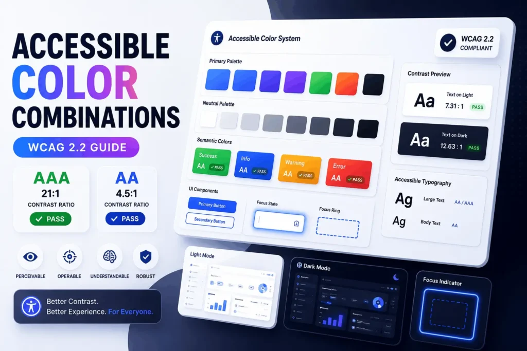
Accessible Color Combinations: A Practical Guide to WCAG-Compliant Design An accessible color combination is any foreground-and-background pairing that meets a contrast ratio of at least 4.5:1 for normal text and 3:1 for large text or UI components, per WCAG 2.2 Level AA. Black on white (21:1) is the extreme case; most working palettes land somewhere […]